Friday July 9, 2021
Lesson Learned!

Yes, I happened to find out how to make write yesterday’s plot better….And reading documentation was the key. I am going to go through as many of the tutorials as I can for my most frequently used libraries and packages.
So, the Seaborn API tutorial showed me that instead of writing this:
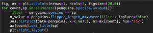
All I had to write was this:

The main difference was that instead of using sns.histplot(), which is an axes-level function. I need to use sns.displot(), which is a figure-level function. If you are going to work extensively with matplotlib/seaborn/plotly or any other such python visualization you need to be clear about figure-level vs. axes-level functions. Read more here and here.
I realize this is beginner stuff but let’s not mistake that in highly technical endeavors the basics must always be repeated. Sometimes, there is a grain that is easily forgotten or taken for granted….also, I am still learning this stuff.
displot() takes a keyword argument kind which can be set to any distribution type. The default is hist so I don’t need to include it if I want to plot a histogram. But Seaborn allows ‘kde’ (‘kernel density estimator)’, ‘ecdf’ (’empirical cumulative distribution function’), and ‘rug’ is a separate keyword argument which take a bool value (True or False).
There are three figure-level functions in Seaborn: displot(), catplot(), and relplot(), which are for distribution plots, categorical plots and relational plots, repectively.
I also used a technique of enumerating the unique species names in the penguins dataset and the resulting numerical count was used to index both the list of species and the axes of the figure where it would apply. Intead, the figure-level function simply separates at the col kwarg. At east for the single-rowed figure, this one line code works, here is the figure and plot:
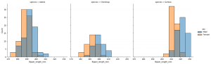
Which is exactly the same as yesterday’s plot. The only differences are that each axes share the same y-scale, the x-scales all have the same limits, the resulting bins are distributed differently, the legend is outside of the plot, and the name of each axes shows the value of species instead of simply the species name. But quite efficient when compared to the previous multi-lined for loop example.
Now, when I apply this to a much larger number of categories such as the Neighborhood column, we get one loooong row:
![]()

I try a small variation:

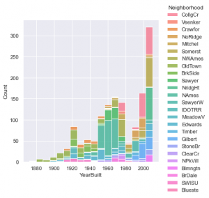
This is a colorful plot but there seems to be a lot to unpack. For the moment we can observe a lot about the general trend of housing construction. it seems that earliest construction was in the 1880. There was a peak in the 1920’s and then another lasting boom from the 50’s to the 70’s followed by a significant dip in the 80’s. Most recently the largest peak in it’s history started in the 90’s and really soared in the 2000’s.
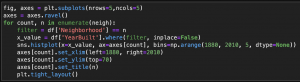
In order to see the breakdown by neighborhood that we initially were aiming for we have to revert to using the longer code with for loop and enumerate:
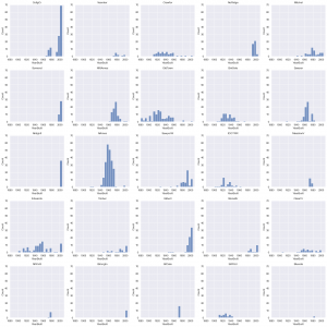
Edwards, Old Town , Barkside, and Crawford are some of the oldest neighborhoods. NAmes had a significant boom between the 50’s and 70’s. There is a huge boom going on in the 2000’s in College Creek due to Iowa State University. North Ridge and North Ridge Heights were both established in the 90’s and 2000’s, but Stone brook has been around since the 80’s.
Again, another detail we could add is the ‘kde’ curve which would describe the curve of the distributions of each neighborhood.
Podcast
I got two podcasts today.
The first was Real Python episode 56. This dealt with ordered dicts and comparing Java and Python in relation to OOP. This made me think it might be good for me to start learning Java next. We will investigate.
The second podcast was Ken Jee’s Ken’s Nearest Neighbors episode 51. This was about elements of storytelling in data presentations and public speaking. This is something that I have experience with as a former teacher. An Joseph Perez seems to have followed a similar path in that he discovered data later in his career and eventually combined them. Very insirational.