
This shows the relationship between Carat and Price. The darker and larger the point the higher the quality of diamond in color and clarity of the diamond.
Wed June 30,2021:
I finally got focused and sat down and dug into the dataset. I am going to follow along with another analysis of a similar dataset. I want to see different ways of doing things and experiment along the way. I got a few good visualizations. I took some time to observe some of the variations between pandas, matplotlib, and seaborn visualizations. So, I refreshed my concepts of building up axes in plt.subplots, I know it’s not that complicated but it is always necessary to refresh and clarify everything. I had forgotten how to do it properly. I suppose my BI Course got so much into Tableau and Excell and I spent so much time with SQL and Statstics that the memory of it leaked out of head.
Because I got down into the documentation, I realized that I could fix yesterday’s visualization problem by changing up the viz libs. I used supbplots instead of pairplots. don’t really know what the problem was before but I found a different way to get the same result.
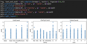
So here are a few scatterplots that compares Carat with each of the other 4 C’s. We make some useful observations: 1) there are a number of Fair cut diamonds on the larger end of the Carat scale; 2) the largest diamonds are mostly rated SI1 on clarity which is also middling; 3) the color of the larger diamonds are not rated high on color either. This is giving us good indication that those are some outliers that we may want to handle.
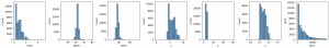
Now, we move to looking at the features containing continuous values. I was happy with the follow through creating a function for this. I might have just gone through a for loop and left it there but now as a good lesson of refactoring, do what you did before but do it better. Your own functions are always useful things to put in your toolbox. The only thing we se is that there are no normal distributions here. So we need to go through some other preprocessing to get more useful distributions.
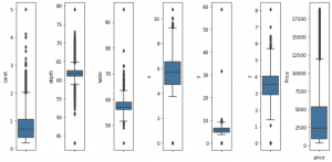
Before eliminating outliers.
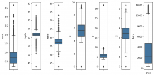
After eliminating outliers
We see the max values for carat has reduced from 10 to 3.5. – significant change
Depth has stayed the same. – no change
Table has reduced from 90 to 80. – small change
x-dimension drops a value above 10 – small change
y-dimension drops a value out in 60 to reduce to 30 – significant change
z-dimension drops from 8 to 6 – significant change
and price reduces from almost 20,000 to a more reasonable 12,000 – significant change
After, doing log transformations. I am getting ready to train-test-split on some models.